How to Get Your Postcards Mailbox‑Ready

Want to create and send postcards through Mailchimp? Not sure how to get started? We’ve got all the design tips you need right here.

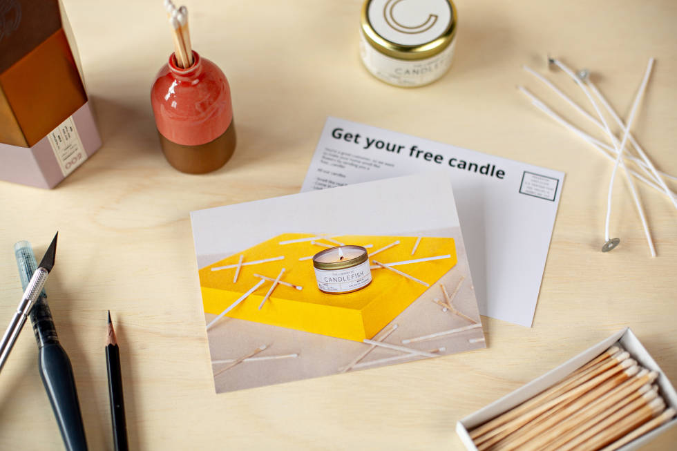
Postcards lying alongside a matchbox filled with matches and writing utensils

In Mailchimp, we take care of the more complicated design tasks so you can focus on making your postcard look great:

  • We show you where we'll trim your postcard (the bleed area), so you can make sure your photos and other important details don't get cut off.
  • We automatically convert your image to CMYK color—the color model used in printing—to ensure it stays vibrant when it's mailed to your contacts.

But in order to get your design just right, you'll want to keep these requirements in mind:

Design elementMeasurement
Postcard dimensions4.25 x 6in
Image dimensions1875 x 1350px or greater
File typeJPEG or PNG
Computer monitor brightness (to avoid digital images appearing too dark when printed)70% or less

Define your goal

Before you start creating your postcard, you'll want to answer these 3 questions:

  • Who is your audience?
  • Why are you sending it?
  • How will you get people to read it?

Whether you're looking to send a postcard to sell more stuff, grow your audience, re-engage inactive contacts, or anything in between, Mailchimp has what you need to reach the right people with a beautiful postcard.

Now that you've identified your goal, let's get to work on your postcard design and copy.

Create your layout

While designing a postcard in Mailchimp takes just a few clicks, starting with a layout (like the one we’ve included below) can help you see where all your elements should go.

Photo of a postcard with grid lines and numbers 1-4 that show where different components should go. Headline at the top reads, "Get $10 off any order of $30 or more."

1. Focus on what’s important. If the goal of your postcard is to encourage people to buy a specific product or use your service, you’ll want to use a visual that makes your main subject stand out. Are you using a photo and planning on taking it yourself? Be sure to adjust your camera’s depth of field or hold your smartphone steady to get a clear close-up.

2. Leave space between elements. White space, also known as negative space, is any area of a design that isn’t taken up by text, photos, or any other element. And leaving some empty space in your design will help focus people’s attention on what they need to know.

3. Use a neutral background. A busy background can make your text and design elements hard to see. People will decide if they’re interested in learning more about you in just a quick glance, so don’t make them work to figure out what you’re offering.

4. Be thoughtful about where you place copy. If you’re adding a headline or any other copy to the front of your postcard, you can make it easier to read by grouping together different types of copy. For example, choose one square for your logo, contact details, and website URL, while your headline or special offer (i.e., “Get $10 off any order of $30 or more”) go in a separate section.

Choose images that will stand out in any mailbox

A beautiful visual is at the heart of any successful postcard. But apart from looking good, your image should help you quickly tell a story.

Mailchimp postcards are 4.25 x 6 inches and printed on UV-coated digital gloss paper stock, making it easy to get straight to the point with your marketing message and design. Your visuals need to be greater than 1875 x 1350px so they don’t look pixelated when printed, and you’ll be able to see if any images you already have stored in our content manager are the right size to work with postcards.

Photo of a postcard lined up against 2 rulers to show the dimensions

Keep the focus on your subject

To keep the story your visual is telling focused, we suggest choosing an image that features 1 thing you want people to buy or do. So instead of promoting 5 different handbags you sell, talk about 1 specific style. And just like with Facebook ads, lifestyle images that show someone using your product tend to get the best results.

Zooming in on your product also gives your customers a detailed view to help them make up their mind about buying. But if you forget to zoom in when you’re taking a photo, editing tools like Photoshop and mobile apps like Snapseed let you quickly crop your images.

When to use illustration

If you’re not promoting a specific product or offer, a beautiful illustration can definitely make a great visual for your postcard. It can also add a warm, playful touch to a welcome or thank-you postcard you want to send to your contacts.

At Mailchimp, we use illustrations on the postcards we send to our customers—like a free sample you can sign up to receive—to create a memorable brand moment.

Photo of a person's hands drawing a picture of a candle with a marker

If you’re looking for a fun way to engage your audience and illustration happens to fit your brand, go ahead and use one to design your postcard.

How to write compelling copy

The secret to writing copy that will keep your postcard out of the junk pile is getting these key things right:

But you’ll also want to consider how your copy and visual will work together. Does your copy make sense when paired with your image? Is it clear what your audience should do next?

Tip: Consider where in the world people will be reading your postcard. Will your audience understand any idioms or playful language you’re using?

Make it easy for people to see your message

Whether or not you add text to the front of your postcard is totally up to you, since you have space on the back to get your message across. But including copy on both the front and back can help you tell a more complete story.

When adding text to your visual, keep these things in mind:

  • Put your main offer and most important details on the front
  • Use as few words as possible, and try not to crowd any white space
  • Make sure your text isn’t on top of or covering your image

Tip: Our built-in photo editor makes adding text to your images quick and easy. You can even crop and resize, adjust levels, and add filters like a pro.

On the back, you can include more details about a sale, product, or any other message you want to get across. This is a good place to mention the benefits of your offer and even restate important info you’ve added to the front, like your CTA. Just remember to keep the copy on the back of your postcard

  • easy to read
  • clear and concise
  • on brand
A photo of a person's hand turning a postcard back and forth to show how the copy on both sides works together. Copy on front: "There's a floral candle for everyone. Is this one yours?" Copy on back: "Get your free candle"

Make sure you’re ready to send

In addition to reading over your copy for errors and checking that your image meets your standards, you’ll want to use our postcard preview tool to get an idea of how your postcard will look when it sends. We’ll show you where the printer will trim your postcard, so you can make sure the key elements of your design won’t be removed.

Ready to create something people can hold on to?

Start Designing Your Postcard
Share This Article